Close
升级到 Vue 3 | Vue 2 EOL

可编辑 SVG 图标系统

基本示例

创建 SVG 图标系统有很多方法,但其中一种利用 Vue 功能的方法是将可编辑的内联图标创建为组件。这种工作方式的一些优势包括:

首先,我们将为所有图标创建一个文件夹,并以标准化方式命名它们,以便于检索

components/icons/IconBox.vue
components/icons/IconCalendar.vue
components/icons/IconEnvelope.vue

这是一个示例仓库,可以帮助您入门,您可以在其中看到整个设置:https://github.com/sdras/vue-sample-svg-icons/

Documentation site

我们将创建一个使用插槽的基本图标 (IconBase.vue) 组件。

<template>
<svg xmlns="http://www.w3.org/2000/svg"
:width="width"
:height="height"
viewBox="0 0 18 18"
:aria-labelledby="iconName"
role="presentation"
>
<title
:id="iconName"
lang="en"
>{{ iconName }} icon</title>
<g :fill="iconColor">
<slot />
</g>
</svg>
</template>

您可以直接使用此基本图标 - 您可能需要更新的唯一内容是 viewBox,具体取决于图标的 viewBox。在基础中,我们正在制作 widthheighticonColor 和图标名称的道具,以便它可以通过道具动态更新。名称将用于 <title> 内容及其 id 以实现可访问性。

我们的脚本将如下所示,我们将有一些默认值,以便我们的图标在未另行说明的情况下始终如一地呈现

export default {
props: {
iconName: {
type: String,
default: 'box'
},
width: {
type: [Number, String],
default: 18
},
height: {
type: [Number, String],
default: 18
},
iconColor: {
type: String,
default: 'currentColor'
}
}
}

currentColor 属性是填充的默认属性,它将使图标继承其周围文本的颜色。如果需要,我们也可以将不同的颜色作为道具传递。

我们可以像这样使用它,IconWrite.vue 的唯一内容是图标内的路径

<icon-base icon-name="write"><icon-write /></icon-base>

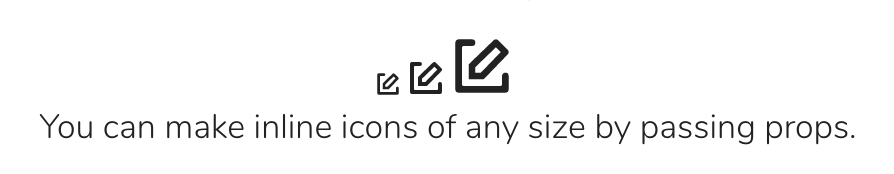
现在,如果我们想为图标制作多种尺寸,我们可以非常轻松地做到这一点

<p>
<!-- you can pass in a smaller `width` and `height` as props -->
<icon-base
width="12"
height="12"
icon-name="write"
><icon-write /></icon-base>
<!-- or you can use the default, which is 18 -->
<icon-base icon-name="write"><icon-write /></icon-base>
<!-- or make it a little bigger too :) -->
<icon-base
width="30"
height="30"
icon-name="write"
><icon-write /></icon-base>
</p>

可动画图标

将图标保存在组件中在您想要对其进行动画处理时非常方便,尤其是在交互时。内联 SVG 在所有方法中对交互的支持度最高。这是一个非常基本的图标示例,它在点击时会进行动画处理

<template>
<svg
@click="startScissors"
xmlns="http://www.w3.org/2000/svg"
viewBox="0 0 100 100"
width="100"
height="100"
aria-labelledby="scissors"
role="presentation"
>
<title
id="scissors"
lang="en"
>Scissors Animated Icon</title>
<path
id="bk"
fill="#fff"
d="M0 0h100v100H0z"/>
<g ref="leftscissor">
<path d="M..."/>
...
</g>
<g ref="rightscissor">
<path d="M..."/>
...
</g>
</svg>
</template>
import { TweenMax, Sine } from 'gsap'

export default {
methods: {
startScissors() {
this.scissorAnim(this.$refs.rightscissor, 30)
this.scissorAnim(this.$refs.leftscissor, -30)
},
scissorAnim(el, rot) {
TweenMax.to(el, 0.25, {
rotation: rot,
repeat: 3,
yoyo: true,
svgOrigin: '50 45',
ease: Sine.easeInOut
})
}
}
}

我们将 refs 应用于我们需要移动的路径组,并且由于剪刀的两侧必须同步移动,因此我们将创建一个可以重复使用的函数,我们将向其中传递 refs。使用 GreenSock 有助于解决跨浏览器的动画支持和 transform-origin 问题。

查看 CodePen 上 Vue 团队的示例:可编辑 SVG 图标系统:动画图标 (@Vue)。


非常容易实现!并且易于动态更新。

您可以在此仓库中看到更多动画示例:这里

其他说明

设计师可能会改变主意。产品需求也会发生变化。将整个图标系统的逻辑保存在一个基本组件中,意味着您可以快速更新所有图标,并使其在整个系统中传播。即使使用图标加载器,某些情况下也需要您重新创建或编辑每个 SVG 以进行全局更改。这种方法可以为您节省时间和痛苦。

何时避免使用此模式

这种类型的 SVG 图标系统在您有许多在整个网站上以不同方式使用的图标时非常有用。如果您在一个页面上多次重复相同的图标(例如,一个带有每个行中都有删除图标的大型表格),那么将所有精灵编译成一个精灵表并使用 <use> 标签加载它们可能更有意义。

替代模式

其他帮助管理 SVG 图标的工具包括

这些工具在编译时捆绑 SVG,但使它们在运行时更难编辑,因为 <use> 标签在执行更复杂的操作时可能会出现奇怪的跨浏览器问题。它们还会留下两个嵌套的 viewBox 属性,因此有两个坐标系。这使得实现稍微复杂了一些。